Ramp Widget
Embed a branded Ramp Widget experience into your product.
Overview
Learn how to embed a pre-built transfer user interface in your website to accept on/off ramps from your customers. We'll walk you through using our Ramp Widget solution, which manages the on/off ramp process.
Ramp Widget simplifies the process of adding SpherePay's comprehensive feature set to merchant applications. It provides everything needed right away, making the setup process effortless for engineers and eliminating the need for direct API connections.
Additionally, Ramp Widget takes care of regulatory, security, and privacy concerns on behalf of the merchants.
Everything happens within the widget and SpherePay's infrastructure, providing a secure and compliant service environment.
High-level workflow
Ramp Widget is hosted on a CDN as a JavaScript bundle.
Installation comes down to initializing the widget within your app, then adding the associated HTML element ID to the target element.
Prerequisites
Make sure you have an account with SpherePay.
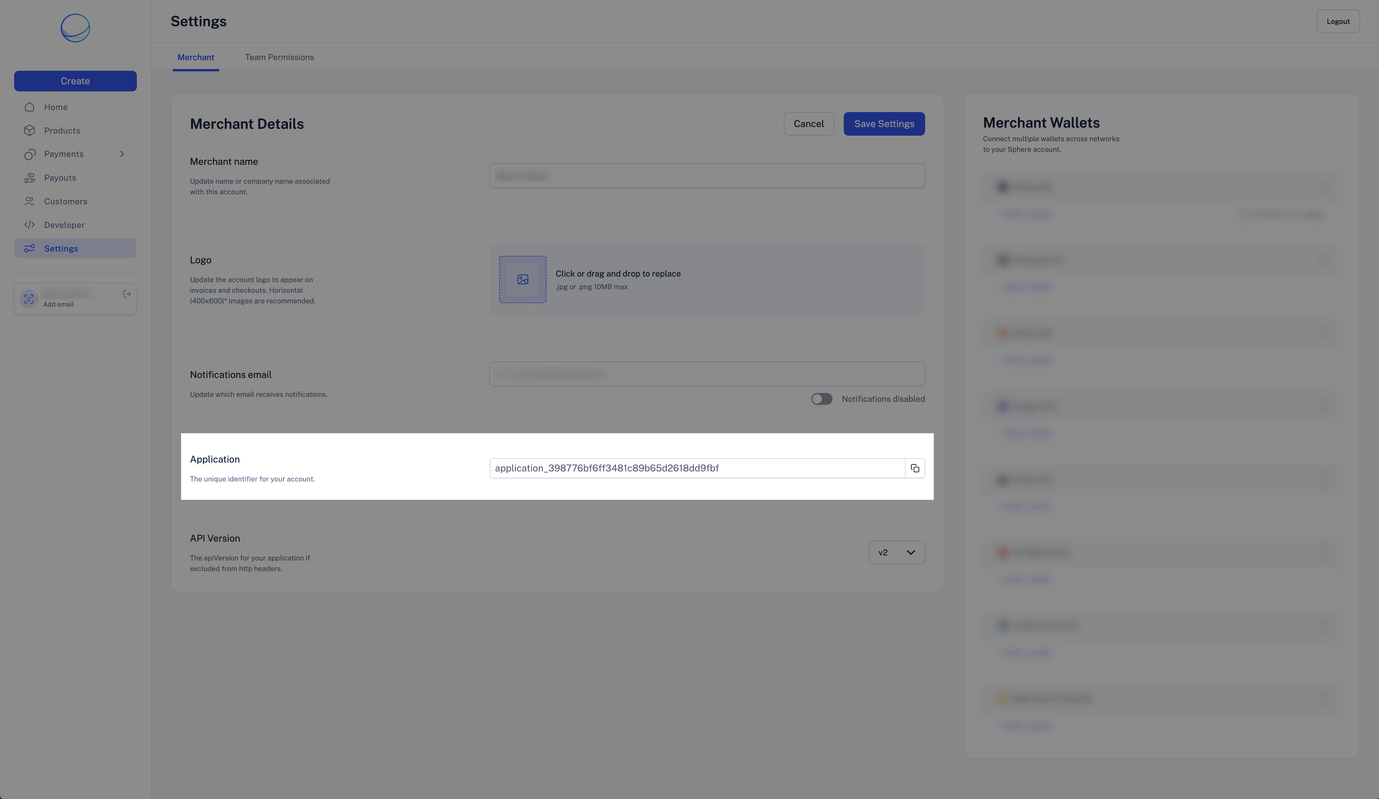
Visit the Settings page and copy the Merchant Application Id.
Live testing
Important
Although designed for experimentation, the Ramp Widget widget loaded under the special /ramp route is still connected to our production environment.
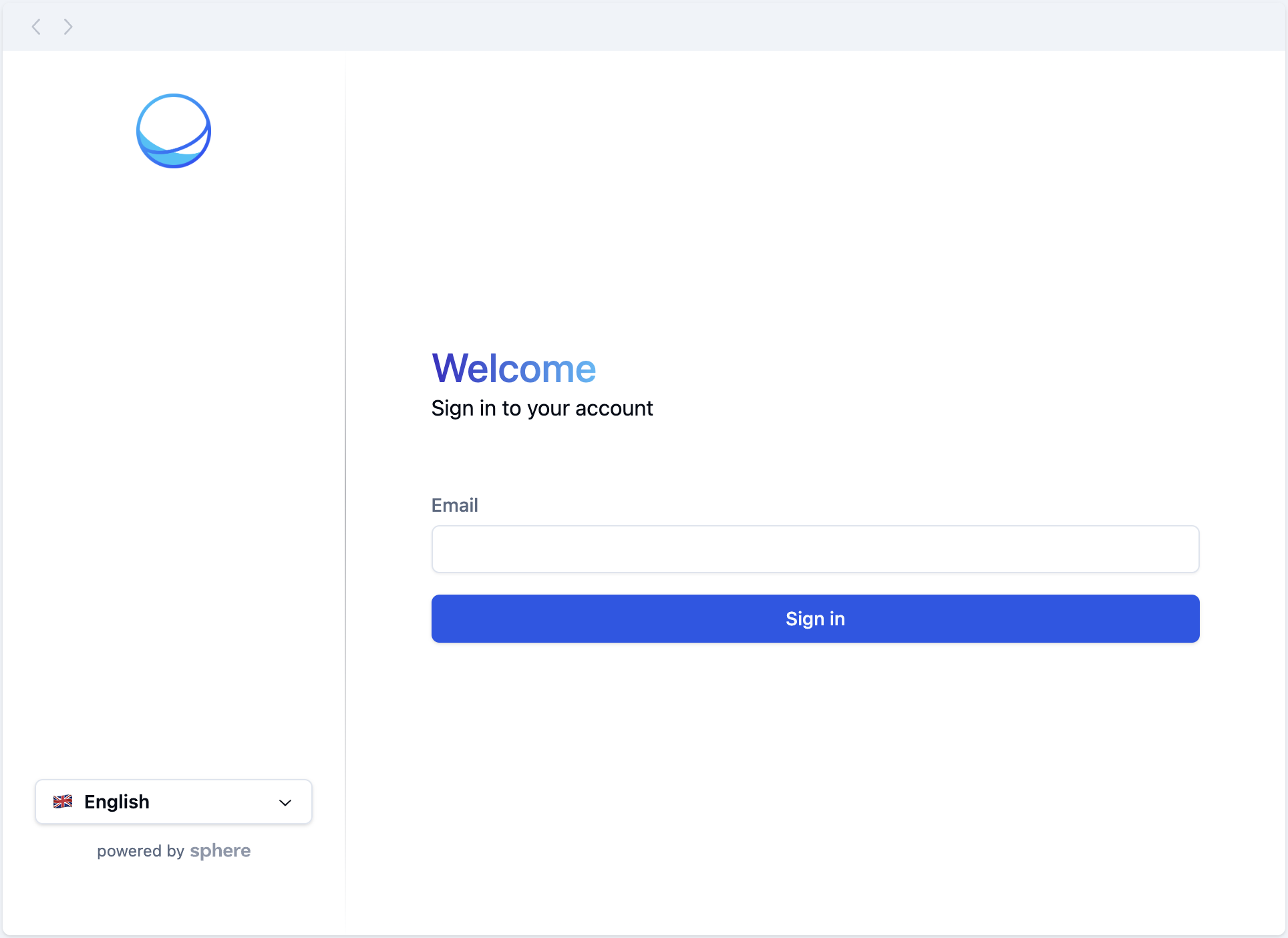
You can experiment with Ramp Widget without writing any code. Visit the RampDemo page and sign up for an account.
You can enable Debug Mode by adding debug=true as an extra parameter.
Setup
-
Import the Ramp Widget script into your application.
-
Add a
scripttag that points to the Ramp Widget bundled source code URL. -
Ensure you have a root HTML element in place for Ramp Widget to mount on.
<html>
  <head>
    <script type="module" crossorigin src="https://spherepay.co/packages/sphere-ramp/index.js"></script>
  </head>
  <body>
    <!-- ... Your App Code ... -->
    <div id="container"></div>
    <!-- ... Your App Code ... -->
  </body>
</html>
-
-
Assign an
onloadproperty to the script tag to call a function that initializes the widget.<script type="module" crossorigin src="https://spherepay.co/packages/sphere-ramp/index.js" // [!code highlight] onload="initSphereRamp()" ></script> -
Implement the initializer function.
function initSphereRamp() {
  new Ramp Widget({
    containerId: 'container',
    applicationId: 'YOUR_APPLICATION_ID',
  })
}
Ramp Widget properties
The Ramp Widget constructor accepts the following properties:
Prop
Type
Debug mode
Only for Development
Ensure this option is disabled before deploying to production.
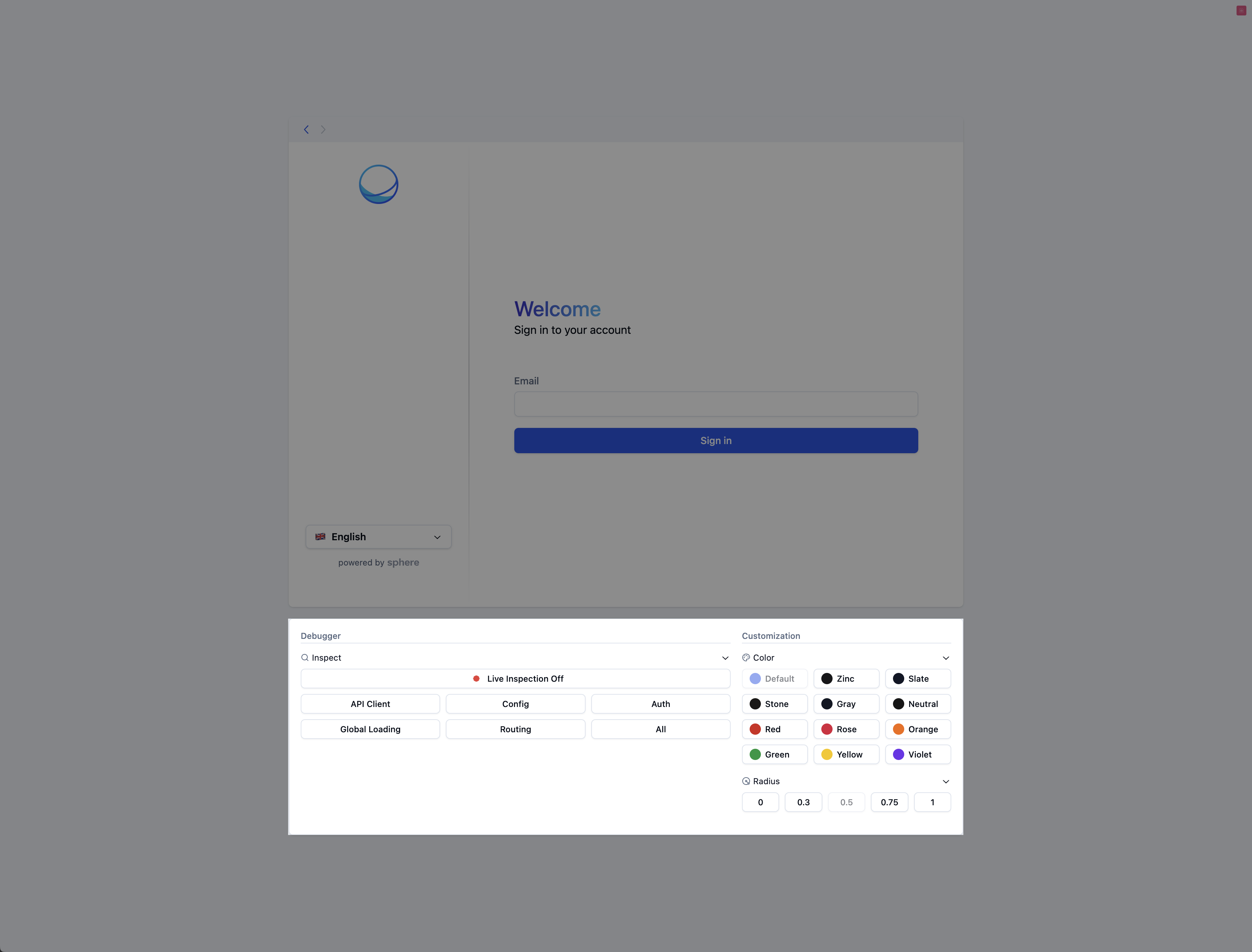
Ramp Widget provides a debug mode for inspecting the application's behavior and exploring customization options.
To enable debug mode, pass debug: true to the configuration object of the Ramp Widget instance:
new Ramp Widget({
  // ...
  debug: true,
  // ...
})
You should then see the debugger beneath the widget:
Further customization
Ramp Widget allows merchants to comprehensively customize the look and feel of the widget, as well as branding assets such as the logo on the top left of it.
To start customizing, pass the theme property to the configuration object. See Theming for all available options.
Theming
Give Ramp Widget the look and feel of your application.
Getting started
Ramp Widget enables merchants to easily customize the widget to match their application's appearance. You do so by creating a theme object and including it in the Ramp Widget instance's configuration.
new Ramp Widget({
  theme: {
    // ...
  },
})
API reference
/** The widget's primary color */
type ThemeColor =
  | 'default'
  | 'zinc'
  | 'slate'
  | 'stone'
  | 'gray'
  | 'neutral'
  | 'red'
  | 'rose'
  | 'orange'
  | 'green'
  | 'yellow'
  | 'violet'

/** The widget's border radius size */
type ThemeRadius = 'default' | 'none' | 'sm' | 'lg' | 'xl'

interface ThemeComponents {
  /**
   * The URL to a custom logo.
   * We suggest using 56px x 56px images due to height constraints, but wider images should also work fine.
   */
  logo: string
}

interface Theme {
  color: ThemeColor
  radius: ThemeRadius
  components: ThemeComponents
}
Example
const theme = {
  color: 'zinc',
  radius: 'none',
  components: {
    logo: '...',
  },
}

new Ramp Widget({
  theme,
})